This article about contact forms that convert appeared on HubSpot and is reprinted on Savvy-Writer with permission.
Who doesn’t hate filling out forms? Hate is a strong word, but sometimes it’s not strong enough. When requiring a contact form to download the goodies you’re offering, you have to think first of the users that will face this form on the other side of the screen. Would the scenario look something like this?
Please enter your name, address, phone number, company name, your great-uncle’s cat’s favorite piece of furniture to scratch…
The potential lead might spew profanities for a while, stub their toe kicking the desk, or threaten to toss the computer out of the window. But the content your ecommerce site offers is really good. So, they keep going, slogging through multiple form fields to get the prize at the end.
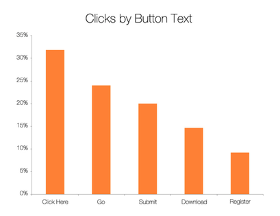
Finally, they succeed, and then there it is: the “Submit” button. “Don’t tell me what to do!” they shout, and then close the window. They’re not alone. Forms using the “submit” button literally have a 3 percent lower conversion rate than those that don’t.
The applicant has gone through enough annoyances filling in your form. (No hard feelings.) Don’t make it any more unappealing. So how can you get someone to submit a form? The answer is: by using a bit of psychology.
What Should Your Forms Say?
1. Word Choice
The first rule of Form Club: Don’t use the word ‘submit’ when you want someone to submit a form. This does sound a bit like a Confucius saying from a fortune cookie, but studies show that “click here” and “go” buttons score nearly 30% and 25% better, respectively.

2. Size Choice
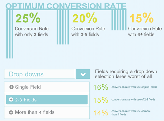
The second rule of Form Club: Size does matter so leave out your unnecessary fields. Cutting the number of fields may be painful at first, like you’re throwing away valuable information, but that loss will feel like a distant tickle when you see that your conversion rates have risen by up to 120% (true story).

3. Field Choice
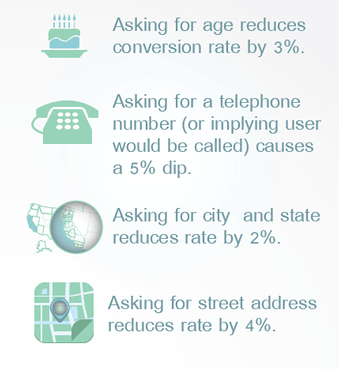
The third rule of Form Club: Unless you operate a business that phones every submitter of a form after they fill out said form, steer away from the phone number field or, at the very least, make the entry optional. No one likes being called by a stranger (not even you) unless it is to inform you that A) you’ve won a million dollars, B) the tests came back negative, or C) *insert favorite movie star* wants to marry you.

4. Participant Choice
The fourth rule of Form Club: Only two guys to a form. Oh wait, that’s a different club.
When Can You Ask for More?
Gathering information on your customers is a tricky thing. You don’t want anyone to feel like you’re peeking into their bedroom with a pair of binoculars, right? Still, every bit of information you gather helps you tailor future content, the services you offer, and even the products you sell to meet their needs.
In fact, think of your contact forms as dates. That’s the real fourth secret. Did you pry for every ounce of information the first time you took a girl (or guy—we’re feminists, too) to dinner? Did you ask her age? If you did, you probably never had a second date. Forms with the “age” field are less likely to convert. Did you ask for her address? Where she works? What her job title is? How much money her company makes yearly? How much she makes every year? Revealing all that information to someone who’s barely an acquaintance is exhausting. And the person who’s asking looks more than a little creepy.
Instead, get the basics to begin with. Next time you go out, ask for a little more. On the third date, you probably have a pretty good grasp on whom you’re buying the lobster for. The same applies to your contact forms. Start with name and email address, and then build from there with one or two questions every time that potential customer comes back. In no time, you’ll know everything you need to make your date’s shopping experience the best ever.
So, test your forms continuously. Kill your darlings when necessary, gather phone numbers on napkins in bars instead of through your forms, and whatever you do, don’t submit to the pressure of using the submit button.
———————-
About the author
Ted Ammon
LinkedIn: https://www.linkedin.com/in/tedammon/
Ted is a technology sales professional with over 10 years of experience selling marketing SaaS, and building high growth sales teams. He is currently the Director of Sales for Privy and previously worked for HubSpot, Performable (acquired by HubSpot) and TimeTrade Systems Inc.
Liked this post? Click here and sign up for the Savvy-Writer newsletter.
